For my first elective i have Graphics...the first week we are concentrating on typography...we were all given a metaphor to deal with ...mine is "LOVE STINKS"! i have researched it and found out that it is a special type of metaphor... it is a "dead metaphor" which is a metaphor that has become so familiar we are no longer temped to visualize (or to see literally) the action that the metaphor refers to. sometimes one metaphor answers another. so "Love stinks" which implies an image of love as a rotten,reeking thing...responds to the more predictable picture of love the sweet-smelling rose." a metaphor is a figure of speech in which an expression is to refer to something that it does not denote in order to suggest a similarity in "love is a battlefield".
to get my ideas going....i did a mind-map to put down on paper all the possibilities.
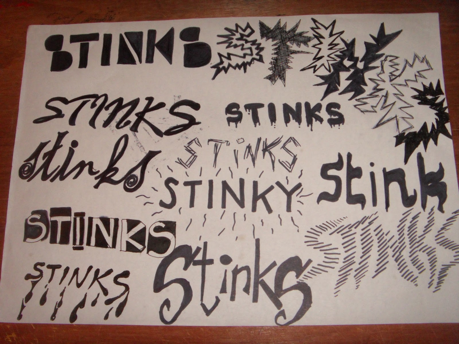
these are my experiments on different typefaces to try and find out which type best suits the metaphor...
this page... i like...A LOT!:) its a very simple concept...i used the shapes of the letters (turning "V" into a triangle shape)of the word "love" to make new shapes by reorganizing them! it very simple looking but it was fun doing it...so i think that is why i like it.
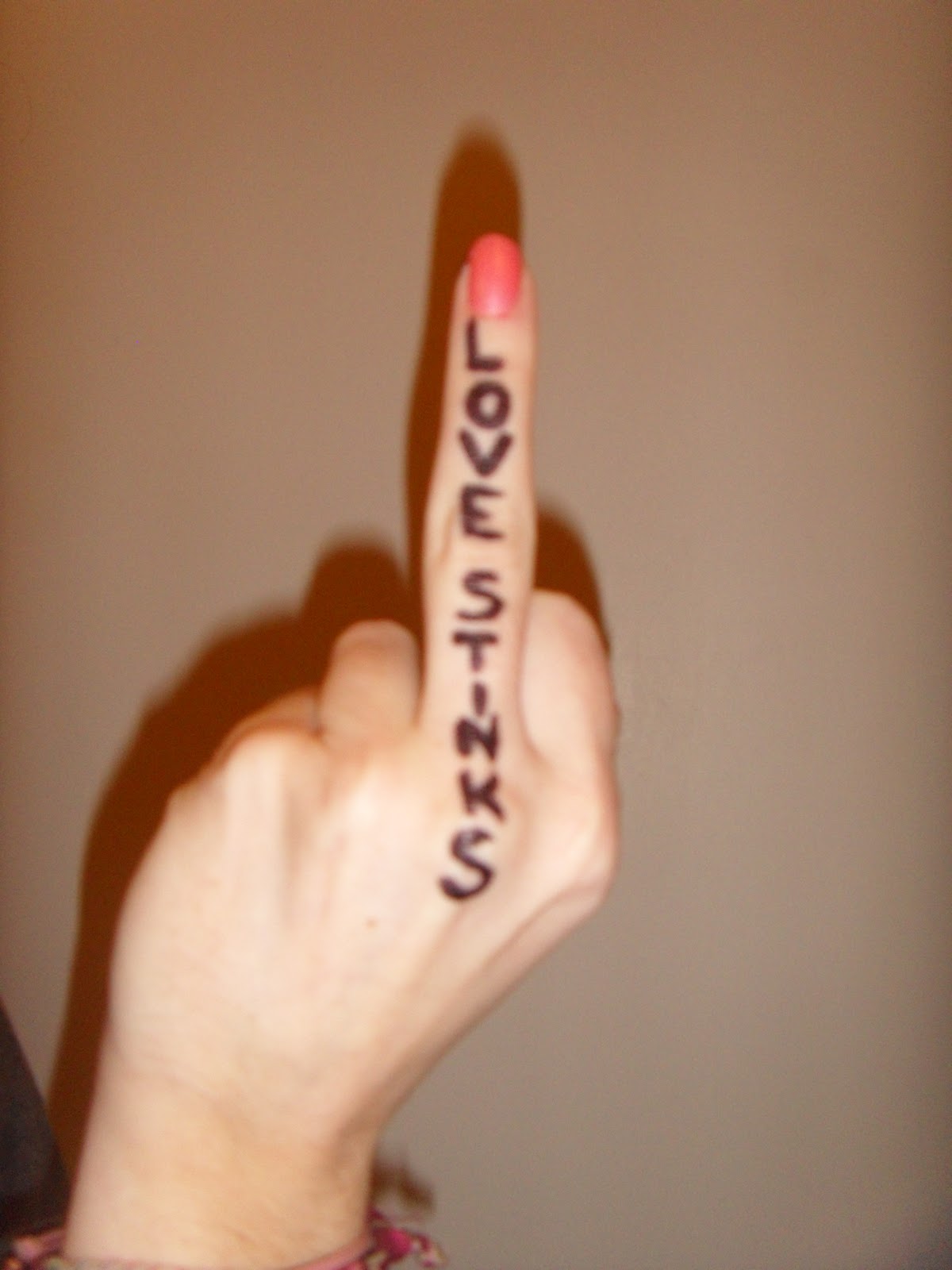
at the start...i was taking things a bit to litterally...i brainstormed "Stink"....i planned on making the word "LOVE" actually stink...i thought this would be a lot of fun!!
this piece of typography is made from vomit...i found it disgusting yet interesting...and i really think it helped to convey the meaning of the sentence..."if you have a weak stomach..be warned!"
this creative typography i found while researching in the library...it is human flesh stretched and pulled into the shape of letters using clothes pegs...i like the idea of clothes peg as it kind of relates to the "stink" part of my metaphor!!
experiments of love..stinking!!
love BITES!(very american saying i know!!)
the opposites....love/hate....stinks/perfume
still working on the whole love actually stinking!!!!